Pros
Cons
Our Verdict
Earlier this year, I spent some time in Italy. Despite a lack of any familiarity with Italian, by the end of the week I’d managed to become more or less proficient at navigating public transportation, figuring out street signs, and even ordering a meal. Because, different though the language might be, all of those were tasks I could map onto familiar experiences.
The experience of switching to iOS 7 is kind of like that: Some things might look wildly different, but underneath them are the same old familiar experiences we’ve become accustomed to over the last six years. It’ll take some time to get used to the changes—just as many of us struggled to adapt to Apple’s “natural” scrolling back in OS X Lion—but after about a week, you’ll be back to tapping and swiping like an expert.
That’s not to suggest that iOS 7 is just a face-lift of Apple’s mobile operating system. As busy as Apple design chief Jonathan Ive and his team of designers have been creating a new visual language for iOS, the company’s software guru, Craig Federighi, and his group have been equally hard at work crafting new features and ways for users to get more done with less effort.
Design may be the watchword of iOS 7, but as Steve Jobs once noted in a sound bite destined to be repeated as long as history remembers him: “Design isn’t just how it looks. Design is how it works.” iOS had in some ways reached a plateau over the last six years, with successive updates reduced to picking off the increasingly sparse low-hanging fruit. So Apple has done more than just change the way iOS looks and feels. It has also reimagined the way iOS works.
The look, the feel of iOS 7
What’s perhaps most striking about the look of iOS 7 is not just what’s different, but also what’s the same. Critics might be tempted to dismiss iOS 7 as simply a palette swap: thin lines where there used to be thick, text where there used to be buttons, simple icons where there used to be complex ones. That’s true within reason: In plenty of the apps, like Notes or Stocks, the functionality hasn’t really changed—just the look has been updated.
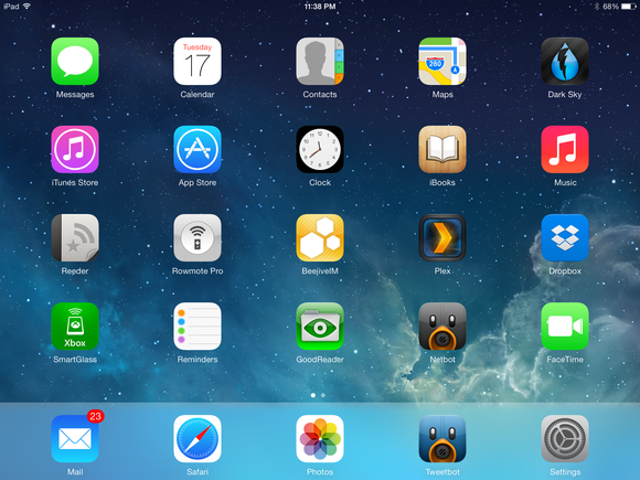
But when you consider the gestalt, something else emerges, like the hidden image in an autostereogram. Over the course of iOS’s development, its design had begun to diverge in different directions: in one direction, the over-the-top skeuomorphism of Find My Friends, Notes, Reminders, Compass, and so on; in the other, the more utilitarian sensibilities of workhorses like Mail, Safari, and Messages.
With iOS 7, Apple has tried to impose a single, consistent experience across its operating system and apps. Not in terms of making apps that all look the same, but rather by establishing a vocabulary of design that can be used to construct apps.
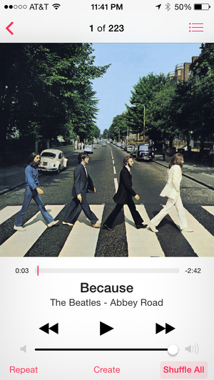
For example, buttons are by and large gone in iOS 7, replaced in many places by text. At first, this struck me as counterproductive, but the more I thought about it, the more I realized how much we’re all used to tapping or clicking on text now. We click on hyperlinks every day on the Web. We tap on the name of the song we want to hear on our iPhone. We’ve long clicked the words File, Edit, View, and so on when using our desktop operating systems. Clicking words as a way of performing actions is second nature to us by now, and I’d posit that in many scenarios it’s actually easier than trying to decipher arbitrary-looking icons.
(That said, it can be confusing when you want to use a toggle, like the Shuffle button in iOS 7’s Music app—I still have trouble figuring out the difference between it saying Shuffle, meaning the command, and Shuffle All, which refers to “the current status of your music playback.”)
Not only would I argue that Apple’s vast undertaking is by and large a success, I’d go even further: iOS 7’s design has stripped the system down to the very essence of what iOS is.
Case in point, the Calendar app. In previous versions of iOS, Calendar on the iPhone was kind of a mess. The Month view showed a calendar-like block of dates over a scrollable list of events. That list only barely became usable with the introduction of the iPhone 5’s larger screen; prior to that, you could see only an event or two. Even on the later iPhones, the interface was only barely usable in that mode; you were better off with the Day and List views, but even those felt as though they lacked a kind of logic. All three views were more or less presented as equals.

Contrast that with Calendar in iOS 7: Now there’s a clearly defined hierarchy. The Year view is the top level; tap any month to drill down into that; tap any date in the Month view to see what’s happening on that day. The top left corner reflects this hierarchy, just as it does in Mail. It makes sense in a way that the earlier versions of Calendar didn’t.
And that Day view, which is now the default, is far more usable than its predecessor; it makes better use of space, has a cleaner design, and even provides a scrollable week calendar.
Such tweaks and revisions—not just relating to how the OS looks but to how it works—abound in iOS 7. Just three that come to mind are accessing Spotlight by swiping down from any home screen instead of having to swipe all the way back past your first home screen; swiping left and holding in a Messages conversation to see timestamps for individual messages; and tapping on the current temperature in Weather to get additional info, including humidity, chance of rain, wind speed and direction, and the “feels like” temperature. Those are little changes, but they all serve to enhance the experience of using iOS.
But don’t worry: Not all the changes are that minor.
Centers of attention
Layering is important in iOS 7; certain system-level features live on layers that can be temporarily superimposed on the rest of the user interface. Two of those are existing features—Notification Center and Siri—while the other, Control Center, is brand new.
Control subject: To start with the new stuff, Control Center is a feature that many iOS users have clamored for since the earliest days of the iPhone. Toggling certain system-level features could be an onerous process that first required you to navigate to wherever you’d hidden your Settings app, and then had you drilling down to the appropriate sublevel until you found the switch you were looking for. Woe betide you if you did any of those things regularly, such as dealing with Bluetooth settings.
Control Center simplifies many of those tasks: Airplane Mode, Wi-Fi, Bluetooth, and Do Not Disturb can all be enabled or disabled from the panel, which is available with a swipe up from the bottom of any screen (including, by default, the lock screen, though you can disable that in Settings).

Several of the items that used to be available by swiping left on the multitasking bar in earlier versions of iOS have moved here too, including media playback—with an interactive scrubber!—and volume controls, the orientation lock, and AirPlay. And, yes, at long last, iPhone users have an easily accessible brightness slider. There’s also a Control Center option for iOS 7’s new AirDrop sharing feature (more on that later).
Also new are four quick-access buttons: One toggles the iPhone’s flash for use as a flashlight, while the other three can be used to launch the Clock, Calculator, and Camera apps, respectively. (On the iPad, which doesn’t have a flash or a calculator app, you’ll just get the other two buttons.)
I give Control Center a hearty thumbs-up: It has certainly made my life easier. That’s not to say it couldn’t stand a couple improvements. Some other features would be helpful to have access to (for me, the VPN), and some of the existing features could be expanded: For example, tap and hold on the Wi-Fi control to bring up a list of Wi-Fi networks. Being able to swap out the quick-launch items for apps of your own choice would be nifty, though I’m not holding my breath on that one. But a button that launches the Settings app would be much appreciated.
One potential complication for Control Center is that its gesture—swiping up from the bottom of the screen—could conflict with certain apps, especially games. Fortunately, Settings allows you to disable the gesture while you’re in apps (so it’s accessible only from your home screens).
You will be notified: Just as you can swipe up to access Control Center, Notification Center is accessible via a swipe down from the top of the screen. But it has gotten a revamp here, most obviously in the form of the new Today pane.
A sort-of answer to Google Now, Today gives you information about your day at a glance: the date, a brief summary of the weather, information about your next appointment, and your commute (or travel time to your next destination if it’s in your calendar).
Also included on the Today pane is information from your calendar, any reminders that are due today, info on your stocks, and a quick paragraph about events for tomorrow including the time your alarm is set for in the morning.
The end result gives new meaning to the idea of a personal digital assistant, providing the information you want, when you want it. It’s a great idea in theory, perhaps suffering only a bit from a lack of depth: I’d like to see even more information in that Today pane, or at least have the option to pull from additional sources or apps.

Google Now, for example, can connect to your Gmail to include information about flights you’ll be taking, sports scores you’re interested in, and so on. Some of this information is handled elsewhere in Notification Center (or in Passbook or Siri), while other types are absent. I understand the inclination to simplify the Today view, but if the goal is to make it relevant, customization is key. At least the Settings app does let you turn off pretty much any individual item in the Today view.
In addition to Today, there are two more panes in Notification Center; you can move between them by tapping toolbar tabs at the top of the screen or simply by swiping left. The All pane is similar to the Notification Center of old: All notifications are collected by app, and you can organize them to list the app that had the most recent notification at the top or you can organize them manually via Settings. There’s still no way to remove individual notifications, but that’s actually okay because now there’s also the Missed tab.
The Missed tab is what I’d been looking for from Notification Center all along: a place that just shows those notifications that I didn’t act on— in other words, I didn’t tap on or dismiss them when they popped up, or I didn’t act on them from the lock screen. The Missed view is an improvement over the All view because it reduces the notifications to the bare minimum; if you don’t view them within 24 hours, they automatically get weeded out of the list. (That way, you don’t have to worry about stale items clogging it up.) On occasion, however, I noticed items that I thought would appear in the Missed tab that didn’t, such as certain Mail notifications.
Like Control Center, Notification Center is available anywhere in the OS; unlike Control Center, though, you can only prevent it from appearing on the lock screen. But there you can enable or disable the Today and notification views separately.
There are a couple of other notification-related improvements: In addition to the VIP notification options introduced in iOS 6 for Mail, you can also set up Messages and Game Center to alert you only about notifications from your contacts. (There’s still no contacts-only option for Mail, though; it’s either VIPs or everybody.)
Talk to the screen: Two years later, my relationship with Siri remains firmly in the love-hate category. I want to love the voice-based interface, and when it works it often shines. But expectations are so high that when it fails—as it invariably does—it’s usually the target of heated invective.
Apple has, to its credit, greatly expanded Siri’s capabilities in iOS 7. The assistant understands more queries than in the past, and now has access to more features of your phone—such as the ability to turn on Airplane Mode, enable or disable Bluetooth and Wi-Fi, and go directly to specific Settings screens. Siri has also expanded its abilities to deal with other information: It can now read the entire text of emails sent to you, play back voicemails, and search for tweets about a subject or by a specific person. (It still can’t read tweets aloud to you, however; you’ll need to refer back to the screen for that.)
And, catching up to Google’s voice-search offering, Siri can now show—and read to you—answers to some questions without leaving the assistant’s interface. For example, ask the age of actor Sean Connery, and Siri will tell you he’s 83, and will show you a capsule of his Wikipedia entry.
Siri also told me actor Cary Grant’s real name (Archibald Leach) and read me the definition of the word foundering. However, while the assistant was able to retrieve the correct answer for the alter egos of Batman and Superman from Wolfram Alpha, it wouldn’t read them aloud. (Interestingly, it did tell me that Spider-Man’s secret identity is Peter Parker—clearly Wolfram Alpha is a Marvel fanboy. Or maybe Wolfram Alpha had multiple alter egos for Supes and Bats, but just the one for Spidey.) In a sign of the further dissolution of Apple and Google’s partnership, Siri’s search results are now provided by Microsoft’s Bing, with no user option for changing the search engine.

Besides its new functionality, Siri gets a new interface in iOS 7. Visually, Siri now fades in on top of your current screen (which you can see, as if through frosted glass, beneath it); instead of the purple-highlighted microphone, you now see a sound wave that reacts when you speak. The virtual assistant also has a new speech engine, which provides not only a more natural-sounding voice, but also, for the first time in U.S. English, both male and female options. You still aren’t likely to mistake Siri for a flesh-and-blood human, but that gap is closing all the time.
Though some, including my erstwhile colleague Lex Friedman, swear by Siri’s capabilities, I’ve found myself more likely to swear at the virtual assistant. iOS 7 has certainly improved its capabilities, but none of that matters when you run into situations where Siri simply shrugs and says it can’t take any requests right now. I’d love to trust the voice-based assistant to do things when I’m in the car, but much of the time it’s still simply not reliable enough.
Working, even when you’re not
A number of the improvements in iOS 7 deal with keeping your phone’s apps and information up-to-date without the need for your involvement. But if you want control over those features, iOS 7 offers that, too.
Pick a card, any card: When it first arrived in iOS 4, Apple’s implementation of multitasking on its mobile devices was greeted with a mix of enthusiasm and derision. The company made the choice to allow only certain types of tasks—playing audio, tracking location, and conducting voice calls, to name a few—in the background. The reason behind the limitations was to prevent background apps from running amok and sucking up all your device’s battery life and/or network bandwidth. Besides, the argument went, what else did you really need your apps to do in the background?
A lot, it turns out. So in iOS 7, that decision has been updated for the modern era. Any app can now run in the background, updating whenever it feels the need. Apple still acknowledges that background tasks can put a hit on a device’s battery, but the company has beefed up iOS’s capabilities for managing those processes, using techniques like pooling updates so that they occur at the same time (preferably when you have a good network connection), prioritizing apps that you use more often, and allowing silent push notifications that can wake up an app that’s running in the background.

It’s hard to judge exactly how well these features work right now, since they rely on a new application programming interface (API); existing apps will have to be updated to take advantage of them. It is gratifying, however, to see that Apple has left us some element of control over the process: In Settings, a new option called Background App Refresh allows you to stop any app—or all apps—from running in the background, just in case a particular piece of software runs amok or eats up too much of your battery.
In short, though Apple’s solution is promising, we’ll need some more time with both iOS 7 and updated apps to determine whether it really delivers on everything that the company has claimed.
That said, the under-the-hood improvements aren’t the only changes to multitasking in iOS 7. There’s an entirely new interface—a card-based metaphor that will look pretty familiar to any who used the all-too-quickly-extinguished webOS. You swipe through a carousel of cards, each showing the screen of a different app accompanied by the program’s icon.
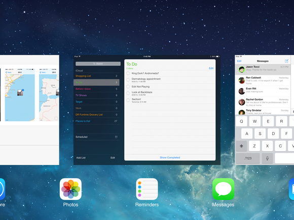
In addition to its interface being more helpfully visual than the old multitasking bar, there are a couple of other advantages here: First, you can actually refer to information on a card without bringing the app to the foreground, which can save you some taps if you’re, say, writing an email and need to refer to something in another app. Second, you can now force-quit an app by simply flicking the card upward—far easier than the old tap-and-hold-then-tap-again interface in iOS 6’s multitasking bar.
Apps updated while you wait: Glory be and hallelujah. If you’ve ever picked up an iOS device you haven’t used in a while and seen that red badge on the App Store icon, you’ve probably sighed and wondered if it’s even worth it to update your apps. (My poor full-size iPad was set aside at the arrival of the iPad mini, and when I first charged it up after several months of non-use, it had well over 60 app updates queued up.)
Automatic app updates work well—almost too well, in fact: Unless you either catch the elusive new app-update icon or check the Updates tab in the App Store (which now, thankfully, tells you which apps have been recently updated and with what changes), you may not even realize you have a new version. If that doesn’t fly with you, you can always disable the automatic updates under Settings > iTunes & App Store; you can also opt to have those updates delivered over cellular data connections as well as via Wi-Fi.
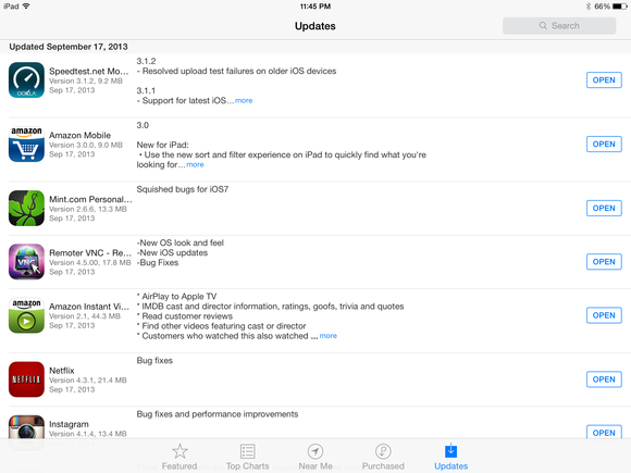
There is a potential wrinkle to auto-updating, of course: What happens when an app developer pushes an update that has a bug in it? It may not happen often, but it does happen, and there’s no way to downgrade to an older version of an app. I’d argue that this is one of those places where the onus is on Apple to either do a better job of reviewing app updates or provide a way to rollback updates or quickly push out bug fixes. But it’s something for users to keep in mind when they enable the feature.
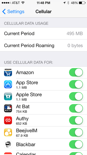
I’m with the band(width): Speaking of cellular data connections, iOS 7 has another welcome improvement: the ability to enable or disable cellular data use on an app-by-app basis. It’s hiding under the Settings > Cellular section, and you might also notice that below each app is an amount, like 1.1MB or 29.6KB—that’s how much data that app has transferred over your cellular connection since the last time you used the Reset Statistics button at the bottom of the screen. Scroll down to the bottom of the list, and you’ll even find a System Services submenu that documents how much iOS’s own services have consumed, though you can’t disable them.
As someone on a metered data plan who occasionally exceeds his data allowance, I appreciate gettin this information straight from the horse’s mouth, although it’s most helpful if you remember to reset it every month at the end of your billing cycle. I double-checked the overall cellular data number against both my carrier’s website and the third-party app DataMan Pro, and though there was a range among the three of them, they were within 7MB—pretty good.
Pictures, perfected
Because our smartphones (and, to a lesser extent, tablets) are increasingly the devices we use to take pictures, every iOS update has its share of photo-related improvements, and iOS 7 is no exception. Organization and sharing are the keywords this time around, along with a few tips of the hat to the popular photo trends of the day.
All those moments will not be lost in time: Finally, finally Apple has rethought the organization of the Photos app. Earlier versions were fixated on the idea that photos would live more or less on your Mac in iPhoto and you would use your smartphone as a portable viewer—how else to explain the lack of any organizational capabilities in iOS’s camera roll?
In iOS 7, the Photos app finally treats the pictures you take with your iOS device as first-class citizens. As in iPhoto on your Mac, your pictures are automatically organized based on when and where you took them. At the lowest level you have Moments, which are photos usually grouped around a single place over a day or two. They’re listed by location and date, and tapping on the header will give you a map view for that Moment, showing where photos were taken; this is a replacement for the Places view in earlier versions of iOS.
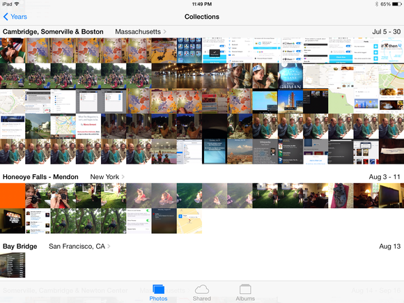
One level up from Moments are Collections, which group photos from longer spans of time and a geographically wider area—think the pictures you took while on a vacation in Italy. As with Moments, you can view those pictures on a map. But you can also tap and hold on any tiny image in the mosaic Photos presents and get a pop-up thumbnail of that image; drag across the mosaic, and you’ll see a blown-up view of whatever picture your finger is resting on.
The reorganization and thumbnail pop-up make it (roughly) three-hundred-and-forty-seven times easier to find a specific picture than scrolling through the camera roll in iOS 6 and earlier. That’s even more impressive when you jump up to the Years level that resides above Collections; it turns out that even when you’re looking at a year’s worth of photos, it’s surprisingly easy to pick out specific moments.
Like the Calendar app, Photos benefits from this implicit hierarchy. It makes organizational sense, and it’s a more logical way to view photos. Yes, you can still create and access existing albums if you want to (that’s where your camera roll and Photo Stream have been relegated to, along with albums that automatically collect videos and panorama images you’ve taken), but really, why put in that work if you don’t have to?
Crossing the streams: Was it just in iOS 6 that Apple introduced Shared Photo Streams? In that case, I suppose we should be glad it only took a year for the company to turn them into what they should have been all along.
In iOS 7, if you want to share photos between two or more people, you no longer need separate shared streams for everybody who wants to add a picture; instead, you simply invite other people to your stream and flip on the Subscribers Can Post switch in the People tab.
Those shared streams aren’t limited to photos anymore, either; you can now add videos into the mix as well. With these additions, Shared Streams almost become private social networks where you can share pictures and videos with your iOS-device-using friends—without having to get them all to use a specific app or service.
It’s also easy to add a Moment into an existing Shared Stream or create a brand-new stream based on that Moment.

In case all these streams get to be too much to keep track of, Apple has also added an Activity entry, a scrollable list of everything that has transpired in your streams (to continue the “private social network” metaphor, think of it like a Facebook wall or Twitter timeline for your shared streams). It’s handy on the iPhone, but it really looks its best on the iPad, where you get a tiled view that’s a bit like viewing the public website version of a Shared Stream.
Oversaturated market There’s nary a camera app on the market that doesn’t have at least some photo filters (thanks, Instagram). And though Apple isn’t known for adhering to the “me, too” school, the opportunity was apparently too good to pass up in iOS 7.
On the upside, these features are at least a) available for live preview (on the iPhone 5 and later), so that you can see what a picture will look like as you take it, and b) nondestructive, so you can remove the filter. There are eight filters, ranging from the monochromatic to the instant-camera-inspired, and you can of course apply them to any photo in your library by using the Edit interface. If you know you like filters, you might like these; if you can’t be bothered, at least they won’t get in your way. (One note: You can’t apply filters to panorama shots or videos.)
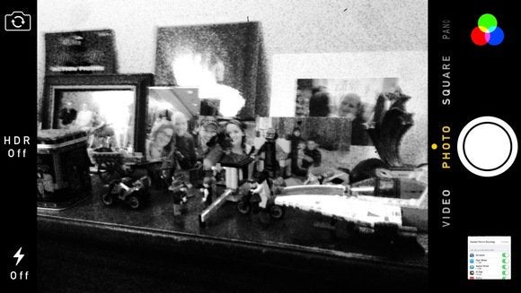
Speaking of Instagram-inspired innovations, there’s a new Square mode in the camera that shoots—you guessed it—square images. Innovation, ladies and gentlemen.
But if there’s one major improvement in iOS 7’s Camera app that I’d tout, it’s the performance. After years and years of being promised speedier photo-snapping, Apple has finally delivered. I’d argue that’s in large part due to the demise of the shutter animation that previous versions of iOS insisted on. Photos snap so fast that you may find yourself mashing the button a couple times before you realize that you’ve already taken the picture. While that may not be a flashy new addition, it’s among the best tweaks in iOS 7.
Drop and give me 20
Ah, AirDrop. I’m a fan—one of the few, perhaps—of AirDrop on my Mac: I use it not-infrequently to transfer files between multiple computers or with others. I think it’s one of the most underappreciated features of OS X.
I don’t think that will be a problem on iOS.
Previously, sharing photos, videos, and other files between iOS devices required that you know the person—that is, that you had their contact information. You could send pictures via email or instant message, but if you wanted to send files to someone, you had to have their address or phone number.

AirDrop’s ability to exchange files wirelessly via a peer-to-peer connection should solve that problem. You’ll see it as an option at the top of the redesigned share sheet whenever you choose the share option. Anybody else in the vicinity running iOS 7 should show up as an icon; tap that (or tap multiple contacts), and you can send one or more files to them via the magic of radio waves.
While Apple has focused on using this feature to share photos, AirDrop shows up in other places, too. For example, you can share a location using Maps, which could be useful if you want to send driving directions to your gathered friends so they don’t have to look up the destination themselves.
If there’s one problem with AirDrop (and there might be more than one), it’s that it is bound to be this year’s feature that you end up explaining to the less technically savvy folks of your acquaintance, and which ends up sounding more complicated than it is.
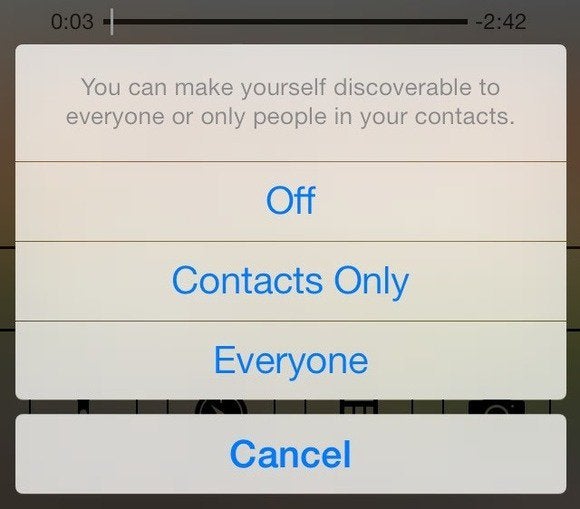
“Make sure you switch it to Contacts,” I imagine myself explaining to my mother, so that random strangers can’t try to AirDrop things to her iPad. “But then you need to have the other person’s iCloud address in your contacts,” I will add. “But you can always turn it back to Everyone if you need to share with someone who’s not in your contacts.”
By this point, I will have pretty much ensured that she will never use the feature.
Which is kind of a shame because, as I said, AirDrop is great when it works. In my testing, I’ve run into problems with the Contacts setting; people who should show up in my AirDrop panel sometimes don’t. Either it’s a little bit touchy or those people are not the friends that I thought they were.
But my biggest question is, “Why doesn’t AirDrop work with the Mac?” In case you don’t believe me, I’ve tested it—oh, I’ve tested it. It seems darned peculiar to release two operating systems with identically named features that work the same way yet are not compatible with one another. What gives, Apple?
My colleague Dan Frakes hypothesizes that there may be a technological stumbling block: On iOS, AirDrop uses Bluetooth 4.0 to configure its connection; not so on OS X. And only the newest Macs have Bluetooth 4.0, so perhaps AirDrop on OS X hasn’t been updated yet.
Personally, my theory is that Apple doesn’t want to make it easy to send arbitrary files from Macs to iOS, because it gets too close to feeling like a traditional computer with an old-fashioned file system. But maybe that’s just me.
Safari, so good
Not surprisingly, Apple’s Web browser gets a refresh in iOS 7, though perhaps the most contentious change has been the app’s newer, simpler icon. (It doesn’t really bother me, but different strokes, etc.) The functional changes to Safari are more significant, but it still remains the browser you’ve used for years.
Unification: The biggest change you’ll notice is the demise of the search bar. It’s now integrated directly into Safari’s address bar, just as it’s been on OS X since Safari 6. Start typing an address or search query into the bar, and Safari will suggest potential hits from your search engine of choice (Bing, Yahoo, Google, or Russian site Yandex), matches from your bookmarks and history, and places where that term appears on the current page. It will also autocomplete the top hit into the address bar so you can just tap Return to go there; both that and the search suggestions can be disabled in Settings > Safari.
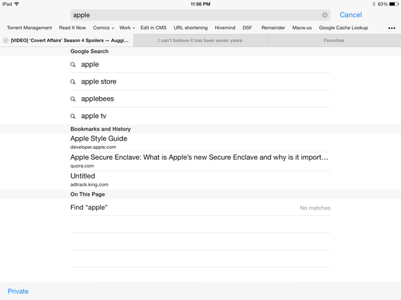
Adjusting to that unified search field did take me some time, especially as Apple has reconfigured the keyboard. Gone is the .com key that’s been a staple since the original iPhone (you can still get the functionality by tapping and holding on the period key), and they crammed a few more keys in there, meaning I often found myself tapping the period or Go key by accident. But as with all muscle memory, I adapted in time. And not having two fields to tap between definitely simplifies things.
Also welcome is the new bookmark screen that appears when you first tap on the location bar: You’ll be presented with icons representing your Favorites (Apple’s new name for the Bookmarks Bar); tap any of them to go to that site. You can actually adjust which items show up there in Settings > Safari > Favorites by selecting any of your folders to use as your Favorites.
See through: As with the rest of iOS 7, Safari sports a new design that emphasizes light colors, thin lines, and translucency.

The changes are more radical on the iPhone: As you scroll, the address bar at the top shrinks down to become just a small line of text indicating what site you’re on; the bottom toolbar, meanwhile, slides away, leaving most of the screen filled by whatever content you’re looking at. Tap on the address bar or near the bottom edge of the screen, and the chrome slides back in; it’ll also reappear when you’re quickly scrolling up or when you reach the end of the page. In landscape view on the iPhone, you don’t even get the shrunken address bar when you’re scrolling.
This full-screen display of content is an improvement over iOS 6’s attempt at the same feature, which worked only in landscape mode on the iPhone and required you to tap a button—even then, you were left with little overlays of back and forward buttons that could obscure content.
So how do you navigate when you can’t see any of the buttons? Apple has expanded its gesture support to Safari, letting you swipe to the right to go back a page, or to the left to go forward a page. This capability has actually been in Safari on OS X for some time, so it’s somewhat surprising that it’s only now making its way to the touchscreen-based OS.
Many users, of course, won’t easily discover those gestures, but those that do will find them a time-saver—think of them as the equivalent of keyboard shortcuts for your iOS device. In fact, in iOS 7 Apple has begun expanding the use of gestures throughout the OS: In any app where you can go “up” a hierarchical level—think Mail or Settings—you can swipe to the right to do the same thing, instead of tapping the button in the top left corner. It’s a nice touch, and definitely simpler when it comes to using devices one-handed—especially with the larger-screen iPhones and iPod touches. The only downside is that you might end up trying to use it in apps where it doesn’t work.

Safari’s tab interface has gotten a redesign on the iPhone as well. Instead of a one-at-a-time thumbnail view of your pages, you get a series of tilted, 3D-esque cards to represent your tabs. It’s easier to flip through them, and you can for the first time rearrange your tabs on the iPhone by tapping any of them and dragging them to their new position. You can also swipe a tab to the left to close it, which is a little easier than trying to hit the small close widget. And Apple has finally broken the only-eight-tabs-at-once barrier on the iPhone; I’m not sure how many you can have open at the same time, but I do know it’s more than 16.
iCloud Tabs have also moved to the tab interface; you scroll down past your list of open tabs to see what pages are open on your other devices. Plus, in a very smart move, Apple has moved the Private browsing feature here, rather than burying it deep in the Settings app. This makes it much easier to use, and far more likely that people will actually remember that it’s there.
Links to the past: The other major new feature in Safari is Shared Links, which is accessible via the Bookmarks button (it’s represented by the @ icon). It’s essentially a collection of the URLs shared by people you follow on Twitter. Tapping on any will load the linked page, and when you scroll to the bottom you’ll have the option to go automatically to the next linked item. (You cannot, however, scroll back up to the previous link once you’ve gone past it.)
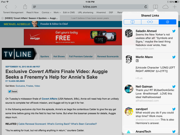
The utility of Shared Links largely depends on you. Personally, as someone who keeps up with Twitter regularly, I tend to follow up on the links I’m interested in via my Twitter client or occasionally save the links to a service like Instapaper. Shared Links can help you find a link if you’ve misplaced it or if you can’t remember who posted it, but for the most part I think this feature isn’t for me. It may, however, be just what you’re looking for.
(It’s worth noting that Reading List in iOS 7 gains the same “continuous scrolling” ability, though it doesn’t get much else in the way of new features.)
Radio, radio
Streaming music’s nothing new—it’s not even anything new for Apple, which offers the ability to stream your purchases from the cloud in iTunes, or from your iTunes library via iTunes Match. But iTunes Radio is something new for Apple: For the first time, the company has opened up its extensive music catalog for streaming without purchase.
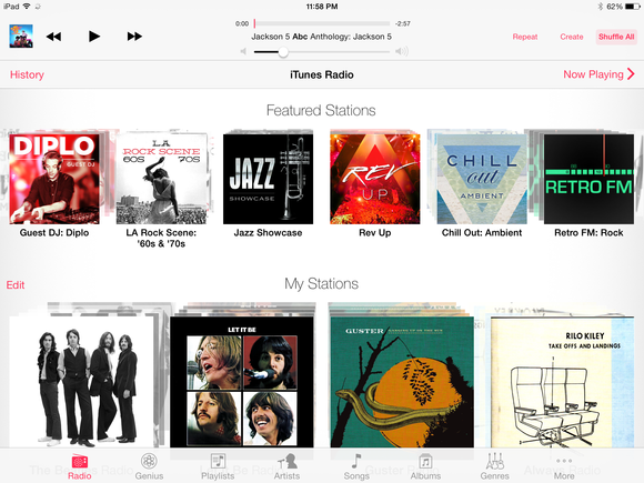
Pandora users will probably find iTunes Radio pretty familiar: Pick a song, artist, or genre, and iTunes will try to construct an ad-hoc “radio station” around it. It may include the song or artist you picked, or it may not, but it should contain other songs like the ones you selected. The selection of content is pretty broad too, though, as always, I’m sure fans of some genres will have better luck than others. I tried a variety of genres including rock, jazz, pop, and even movie soundtracks with pretty good results. You can also create a new station from any song or artist in your library by tapping the Create button while you’re playing that track.

You can tune stations as you listen by tapping the star icon—don’t worry, it doesn’t automatically mean you like that track. You’ll get a submenu that allows you to decide whether iTunes should play more songs like this or never, ever play this song again.
If you’re looking at a station you create, you’ll also find a nifty little slider that lets you choose between hearing popular hits, more-obscure tunes, or a mix of the two. That’s not available on Apple’s own stations, which are more like playlists (it seems as though you largely get the same songs); you can’t choose the more-songs-like-this or never-play-this-song options from those curated collections.
Tapping the info (i) button at the top of the screen will tell you more about the current track, let you browse the album it’s from, create a new station from the artist or song, add the station to your own personal list if it’s one you didn’t create, or share the station with someone else. You can also choose whether or not to include explicit tracks.
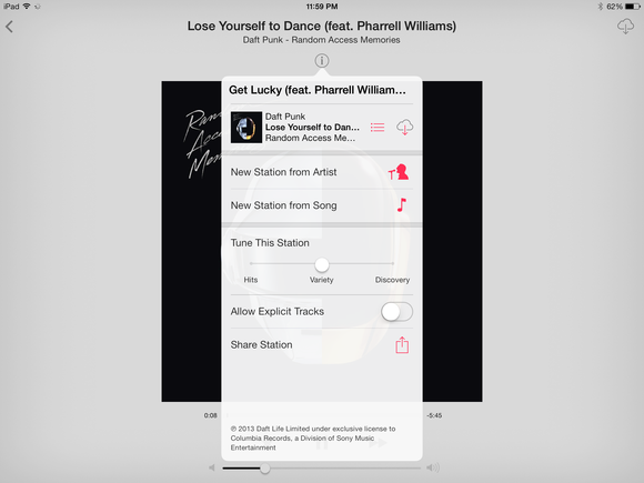
And, of course, you can buy any song you stream, which is what the labels and Apple are both counting on. Just tap the price button in the top right corner, and you’ll be treated to an experience similar to the iTunes Store experience.
You can skip songs, too, by tapping the next-track button, but you’re limited to just six per station; they seem to reset every hour or so. Because I’m an iTunes Match subscriber, I didn’t run into any ads—my colleague Chris Breen said he heard one for the iTunes Festival before enabling iTunes Match, and I encountered a “station identification” on one of Apple’s own stations.
Streaming works very well for the most part, though I did run into occasional interruptions based on my network connection.
At the end of the day, iTunes Radio is very, well, nice. It’s well-put-together, it works, and by building streaming natively into iOS it ensures itself a solid audience. It may not be revolutionary or even really that evolutionary; it’s simply a solid implementation of an existing idea, and one that has the potential to bring more revenue in to Apple, along with letting users discover new music.
Wrapping up
I’ve focused mainly on the highlights, but there’s a lot more that’s new in iOS 7, and you’ll find plenty about it all elsewhere on Macworld.
All those changes have their positives—who doesn’t like new stuff?—but there are also downsides. Any major new release is going to have some bugs. Some will be minor: graphics that render badly, apps that lock up and crash. Some may be more painful, like apps that quit on launch, and some bugs we may not be able to anticipate at all. Third-party apps may not be updated to work with new features, or may run into other bugs, or their design may simply not mesh with iOS 7’s right away.
Those are reasons not to upgrade immediately, but they’re not reasons not to upgrade ever. The only reason not to do that, as far as I can tell, is if iOS 7 doesn’t perform well on your device, which it may not on older hardware, such as the iPhone 4 or iPad 2. My test devices were an iPhone 5 and a third-generation iPad; the former performed like a champ, while the latter, while functional, was a bit sluggish; it’s worth noting that the iPad version of iOS 7 is still rather uneven at present.
But all that aside, iOS 7 is the way of the future for Apple’s mobile platform—the company is not going to turn around next year and say, “Just kidding! Back to the iOS 6 style!” And yes, I know I’ve said this a lot, but it bears repeating: It’s going to require some adjustment.

I’ve spent a decent amount of time with iOS 7 since its debut earlier this year. I like it. There—I said it. I’m pro-iOS 7. To me, the new interface looks sleek and clean and modern. It smacks of purpose-driven design. Whenever I returned to my iOS 6 reference devices, the interface seemed funny and cartoonish—the same way I think the early Aqua stylings of OS X would look from the vantage point of Mountain Lion. The world has moved on, and a smartphone OS today doesn’t need to do the same thing that it did six years ago when the market was still brand new.
In my opinion, there’s a lot to love about iOS 7, even with its rough edges. As third-party apps start to be built around its new capabilities and embrace its new design, I think there will be even more to recommend it to users. But for now, it’s clear which way the wind is blowing, and even if you hold off upgrading to iOS 7 today (or this week), its arrival on your iOS devices is inevitable.
So, kick back and relax. Pump some jams from iTunes Radio, fiddle around with Control Center, browse through your photos and relive some memories. Because iOS 7’s greatest triumph is making the familiar feel a little unfamiliar to us, affording us anew that joy of discovery and wonder—and you rarely get a chance to experience something again for the first time.
Updated at 11:20 a.m. PT with a video review.

